Most of us pass by hundreds of logos every single day without giving them a second thought.
They appear on our phones, coffee cups, billboards, food packaging, clothing labels, and computer screens. We recognize them instantly, often without even reading the names attached to them. A simple color combination or shape is enough for our brains to identify a brand in a fraction of a second.
But what if those logos are doing far more than simply helping us recognize a company?
What if some of the world’s most famous designs contain hidden messages, subtle symbols, and carefully crafted details that most people never notice?
The truth is that logos are rarely created by accident.
Behind nearly every successful logo lies a team of designers, psychologists, marketers, and branding experts who understand something fundamental about human nature: people do not simply buy products. They buy stories, emotions, and identities.
A great logo doesn’t just tell you who a company is.
It tells you how the company wants you to feel.
Once you begin noticing these hidden details, you may never look at familiar brands the same way again.
Take the famous FedEx logo, for example.
At first glance, it appears simple clean purple and orange lettering arranged in a straightforward design. But hidden between the letters “E” and “x” lies a white arrow formed entirely through negative space.
Many people use the logo for years without ever noticing it.
Yet once seen, it becomes impossible to ignore.
The arrow quietly symbolizes speed, precision, and forward movement perfectly reflecting the company’s identity as a delivery service.
The brilliance lies in its subtlety.
The message enters the mind almost invisibly.
Another well-known example comes from the Subway logo.
Look closely at the first and last letters.
The “S” contains an arrow pointing inward, while the “Y” ends with an arrow pointing outward. Together, they suggest motion, travel, and movement from one destination to another.
Without saying a word, the logo communicates the idea of fast service and people constantly on the go.
Then there is Toblerone, the iconic chocolate brand.
Many people recognize the mountain featured in its logo but fail to notice the hidden bear embedded within it. The bear is a tribute to Bern, Switzerland, often called the “City of Bears,” where the chocolate company originated.
The hidden animal serves as a quiet nod to the brand’s heritage.
It transforms an ordinary logo into a story.
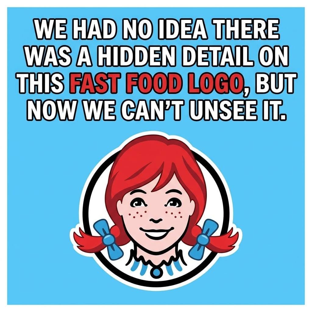
Wendy’s offers another example often discussed online.
Some observers have pointed out that the ruffles on Wendy’s collar appear to spell the word “MOM.” Whether intentional or coincidental, many believe the detail subtly reinforces feelings of homemade comfort and family cooking.
Regardless of the designers’ original intentions, the association itself demonstrates how powerfully humans search for meaning in visual design.
Our brains are natural pattern-finders.
We constantly look for stories, symbols, and connections even when none were deliberately placed there.
This tendency is known in psychology as pattern recognition.
It is one reason logos can become so deeply embedded in memory.
Designers understand that humans process visual information much faster than words. A carefully placed shape or hidden image can create emotional reactions almost instantly.
Consider Amazon’s famous logo.
The orange arrow stretching from the letter “A” to the “Z” serves two purposes at once.
First, it forms a smile, creating feelings of friendliness and satisfaction.
Second, it suggests that the company sells everything from A to Z.
One simple design accomplishes multiple goals simultaneously.
That is the power of effective branding.
The logo for Baskin-Robbins hides the number “31” within the letters “BR,” referencing the company’s original promise of thirty-one ice cream flavors—one for every day of the month.
Again, the detail is easy to miss.
Yet once discovered, it creates a sense of cleverness and delight.
People enjoy uncovering hidden meanings.
It feels like solving a puzzle.
This emotional reward strengthens memory and creates deeper connections between consumers and brands.
Perhaps one of the most famous examples of hidden design is found in the NBC logo.
The colorful shape is not merely decorative.
It forms a peacock with spread feathers, originally symbolizing the network’s embrace of color television during an era when many households still used black-and-white screens.
Even today, the peacock remains one of the most recognizable media symbols in the world.
What makes these designs so effective is not manipulation alone.
At their best, logos function as visual storytelling.
They compress history, identity, and values into a single image.
In many ways, logos resemble modern hieroglyphics.
Ancient civilizations used symbols to communicate complex ideas quickly. Today’s brands do something remarkably similar.
A single icon can evoke trust, excitement, nostalgia, luxury, or adventure in an instant.
Color itself also plays a powerful role.
Red often communicates energy and urgency.
Blue frequently conveys trust and reliability.
Green is commonly associated with nature and health.
Black may suggest sophistication or authority.
These associations are not universal, but they are deeply rooted in both psychology and culture.
Designers carefully select colors because they understand that emotion often drives decisions before logic even enters the picture.
This does not necessarily mean consumers are helpless victims of branding.
In fact, understanding how design works can be empowering.
When people learn to recognize visual persuasion, they become more aware of how companies communicate and influence behavior.
Awareness changes everything.
Suddenly, logos become more than decorations.
They become conversations.
Every curve, color, font, and empty space may carry meaning.
Some symbols were intentionally placed by designers.
Others emerge through interpretation and collective imagination.
Both reveal something fascinating about human perception.
We are storytelling creatures.
We search for significance everywhere.
A hidden arrow becomes movement.
A mountain becomes history.
A smile becomes trust.
The world around us is filled with visual language, and brands have become some of its most skilled speakers.
Yet perhaps the most remarkable part of all is not that companies design these symbols.
It is that millions of people absorb them every day without consciously realizing it.
The next time you pass a billboard, open an app, or hold a familiar package in your hands, take a second look.
Study the spaces between the letters.
Notice the shapes hidden in plain sight.
Ask yourself what story the designer wanted to tell.
You may discover that logos are far more than simple graphics.
They are tiny pieces of psychology, art, history, and communication woven together into symbols so familiar we often stop seeing them altogether.
And once you begin noticing the hidden messages around you, the world starts to look very different.
Because sometimes the most powerful stories are not spoken aloud.
They are hiding quietly in plain sight, waiting for someone to finally notice them.